White continues — and will continue — to be the overwhelmingly popular choice for kitchen cabinets. Some 42 percent of homeowners will choose white cabinets this year, according to a recent Houzz study on kitchen trends. But the choices you make in addition to the white cabinets will make the difference between having a comfortable, bright space and an icy lair reminiscent of Superman’s Fortress of Solitude. The following kitchens with white cabinets show how to introduce color, contrast and warmth.
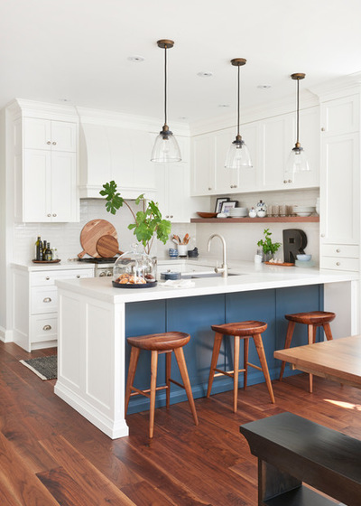
1. Accessories and Color
Designers: Orsi Panos of Orsi Panos Interiors and Louie Katsis of Olympic Kitchens
Location: Toronto
Homeowners’ request: Overhaul a combined kitchen, family area and seating area into a new kitchen with white cabinets and a dining area.
Balance: Open walnut shelf. Blue gray paint on the peninsula — “It’s just enough color so the kitchen doesn’t feel all-white,” designer Orsi Panos says. Accessories like large wood cutting boards, plants and blue-and-white dishes bring more balance.
Special features: Quartz countertops. Full-height cabinetry. Nine-foot ceiling.
Also on the team: Lyons Construction (general contractor; flooring installation)
Peninsula accent paint: Lead Grey, Benjamin Moore; cabinet paint: Simply White, Benjamin Moore; wall paint: On the Rocks, Sherwin-Williams; countertops: Calacatta Nuvo quartz, Diamante Granite and Marble; pendant lights: Union Lighting; backsplash tile: Olympia Tile; stools: Shelter Furniture; faucet: Plumbing & Parts Home Centre; runner rug: H&M Home; art: Art Interiors; flooring: hardwood, Summit International Flooring
See more of this kitchen and home
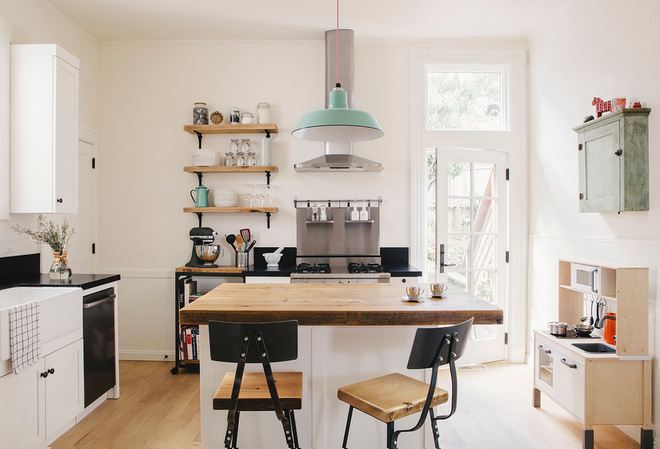
2. Contrast
Designer: Senalee V. Kapelevich of SVK Interior Design
Location: San Francisco
Size: 169 square feet (15.7 square meters); 13 by 13 feet (3.9 by 3.9 meters)
Homeowners’ request: An open, family-friendly kitchen in a Scandinavian style that’s not too cold.
Balance: Honed black granite countertops, black steel stools and shelf brackets contrast the white cabinets and walls. A butcher block countertop on the island, along with wood shelves, adds warmth. “Then we layered on our accent color, which was mint,” designer Senalee Kapelevich says. “We worked that in through the accessories and the lighting.”
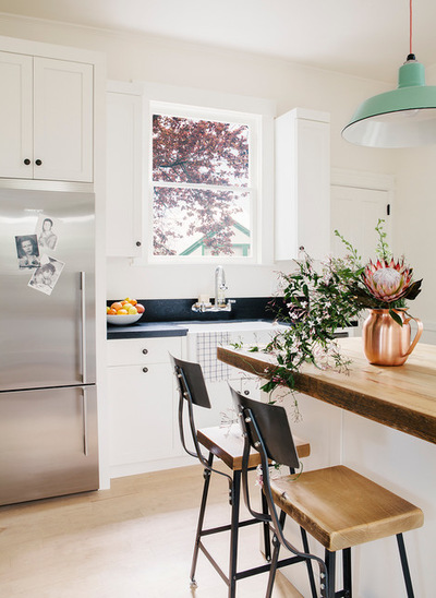
Designer secret: “Anytime you work on a home that is 100 years old, you always have surprises hiding in your walls after you open them up,” Kapelevich says. “Typically you are forced into upgrading most of your electrical and plumbing. These are upgrades that are expensive but necessary. I always have clients reserve 15 to 20 percent of their total budget to address unexpected issues.”
Also on the team: Michele Lee Willson Photography
Cabinetry: Columbia Cabinets; countertops: honed black granite and butcher block; pendant lights: Barn Light Electric Co.; bar stools: Etsy; shelving: Rejuvenation
See more of this kitchen
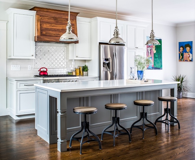
3. Warmth
Designer: Kellie Boyce of Studio77 Interiors
Location: Atlanta
Size: 358 square feet (33.2 square meters); 26½ by 13½ feet (8 by 4.1 meters)
Homeowners’ request: More open layout, classic look, clean lines, modern fixtures and finishes, mudroom.
Balance: Red oak floors and custom range hood with walnut stain bring warmth. A gray painted island introduces contrast.
Special features: Motorized pullout trash can next to the sink. Microwave built into the island. Large pantry cabinet.
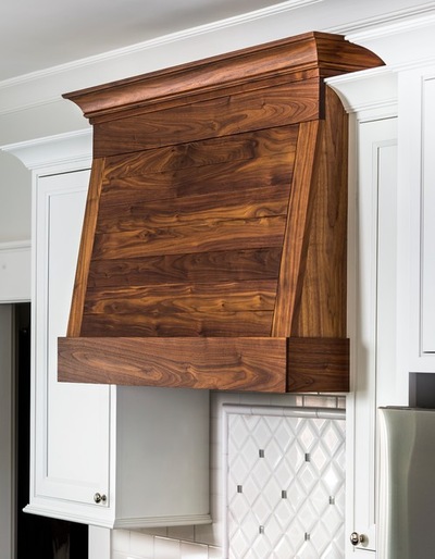
Why the design works: “Changing the location of the door to the garage was really what made the difference in this design,” designer Kellie Boyce says. “I was able to utilize that wall and make this kitchen much more functional.”
Designer secret: “Some might ask why we didn’t take the cabinets to the ceiling,” Boyce says. “It was really a matter of cost. To add additional cabinetry would cost more.”
“Uh-oh” moment: “We knew we had a plumbing vent stack to deal with which was located in the kitchen,” Boyce says. “We were under the assumption that we could move it. When opening up the walls and investigating further, [we discovered] it was not an ideal situation to move this pipe. We went back to the drawing board and had to rework the cabinetry at the sink wall to accommodate this pipe. We were able to turn the pipe into the mudroom and rework the cabinetry slightly in there as well. There is an end cabinet at the sink wall that is actually a shallow cabinet, and behind it we hid the pipe.”
Also on the team: Piedmont Craftsmen Homes; Dove Studio (cabinetry); Jeff Herr Photography
Backsplash tile: Specialty Tile Products; cabinetry: Shiloh, Dove Studio; countertops: LG quartz, Toro Granite; pendants: Elk Lighting; cabinet hardware: Lily pull, Top Knobs; island paint: Classic Gray, Benjamin Moore